Je n'ai pas encore testé cela avec seaborn, mais ce qui suit fonctionne avec vanilla matplotlib.
#!/usr/bin/env python
"""
Annotate a group of y-tick labels as such.
"""
import matplotlib.pyplot as plt
from matplotlib.transforms import TransformedBbox
def annotate_yranges(groups, ax=None):
"""
Annotate a group of consecutive yticklabels with a group name.
Arguments:
----------
groups : dict
Mapping from group label to an ordered list of group members.
ax : matplotlib.axes object (default None)
The axis instance to annotate.
"""
if ax is None:
ax = plt.gca()
label2obj = {ticklabel.get_text() : ticklabel for ticklabel in ax.get_yticklabels()}
for ii, (group, members) in enumerate(groups.items()):
first = members[0]
last = members[-1]
bbox0 = _get_text_object_bbox(label2obj[first], ax)
bbox1 = _get_text_object_bbox(label2obj[last], ax)
set_yrange_label(group, bbox0.y0 + bbox0.height/2,
bbox1.y0 + bbox1.height/2,
min(bbox0.x0, bbox1.x0),
-2,
ax=ax)
def set_yrange_label(label, ymin, ymax, x, dx=-0.5, ax=None, *args, **kwargs):
"""
Annotate a y-range.
Arguments:
----------
label : string
The label.
ymin, ymax : float, float
The y-range in data coordinates.
x : float
The x position of the annotation arrow endpoints in data coordinates.
dx : float (default -0.5)
The offset from x at which the label is placed.
ax : matplotlib.axes object (default None)
The axis instance to annotate.
"""
if not ax:
ax = plt.gca()
dy = ymax - ymin
props = dict(connectionstyle='angle, angleA=90, angleB=180, rad=0',
arrowstyle='-',
shrinkA=10,
shrinkB=10,
lw=1)
ax.annotate(label,
xy=(x, ymin),
xytext=(x + dx, ymin + dy/2),
annotation_clip=False,
arrowprops=props,
*args, **kwargs,
)
ax.annotate(label,
xy=(x, ymax),
xytext=(x + dx, ymin + dy/2),
annotation_clip=False,
arrowprops=props,
*args, **kwargs,
)
def _get_text_object_bbox(text_obj, ax):
# https://stackoverflow.com/a/35419796/2912349
transform = ax.transData.inverted()
# the figure needs to have been drawn once, otherwise there is no renderer?
plt.ion(); plt.show(); plt.pause(0.001)
bb = text_obj.get_window_extent(renderer = ax.get_figure().canvas.renderer)
# handle canvas resizing
return TransformedBbox(bb, transform)
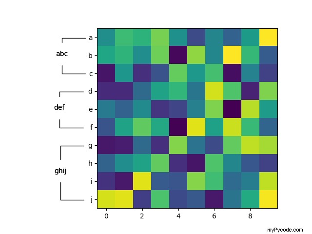
if __name__ == '__main__':
import numpy as np
fig, ax = plt.subplots(1,1)
# so we have some extra space for the annotations
fig.subplots_adjust(left=0.3)
data = np.random.rand(10,10)
ax.imshow(data)
ticklabels = 'abcdefghij'
ax.set_yticks(np.arange(len(ticklabels)))
ax.set_yticklabels(ticklabels)
groups = {
'abc' : ('a', 'b', 'c'),
'def' : ('d', 'e', 'f'),
'ghij' : ('g', 'h', 'i', 'j')
}
annotate_yranges(groups)
plt.show()
J'ai reproduit l'exemple que vous avez donné dans Seaborn, en adaptant la réponse de @ Stein à partir d'ici.
import pandas as pd
import numpy as np
from matplotlib import pyplot as plt
from itertools import groupby
import datetime
import seaborn as sns

def test_table():
    months = [datetime.date(2008, i+1, 1).strftime('%B') for i in range(12)]
    seasons = ['Winter',]*3 + ['Spring',]*2 + ['Summer']*3 + ['Pre-Winter',]*4
    tuples = list(zip(months, seasons))
    index = pd.MultiIndex.from_tuples(tuples, names=['first', 'second'])
    d = {i: [np.random.randint(0,50) for _ in range(12)] for i in range(1950, 1960)}
    df = pd.DataFrame(d, index=index)
    return df

def add_line(ax, xpos, ypos):
    line = plt.Line2D([ypos, ypos+ .2], [xpos, xpos], color='black', transform=ax.transAxes)
    line.set_clip_on(False)
    ax.add_line(line)

def label_len(my_index,level):
    labels = my_index.get_level_values(level)
    return [(k, sum(1 for i in g)) for k,g in groupby(labels)]

def label_group_bar_table(ax, df):
    xpos = -.2
    scale = 1./df.index.size
    for level in range(df.index.nlevels):
        pos = df.index.size
        for label, rpos in label_len(df.index,level):
            add_line(ax, pos*scale, xpos)
            pos -= rpos
            lypos = (pos + .5 * rpos)*scale
            ax.text(xpos+.1, lypos, label, ha='center', transform=ax.transAxes)
        add_line(ax, pos*scale , xpos)
        xpos -= .2

df = test_table()

fig = plt.figure(figsize = (10, 10))
ax = fig.add_subplot(111)
sns.heatmap(df)

#Below 3 lines remove default labels
labels = ['' for item in ax.get_yticklabels()]
ax.set_yticklabels(labels)
ax.set_ylabel('')

label_group_bar_table(ax, df)
fig.subplots_adjust(bottom=.1*df.index.nlevels)
plt.show()
Donne :
J'espère que ça aide.