Si vous n'avez pas explicitement besoin d'utiliser pandas (ce que vous ne faites pas, s'il ne s'agit que d'une matrice de fréquence), pensez à utiliser numpy.histogram2d :
# Sample data
x = 100*np.random.random(15)
y = 100*np.random.random(15)
Construisez vos bacs (puisque vos bacs x et y sont identiques, un ensemble suffit)
bins = np.linspace(0, 100, 5+1)

# bins = array([  0.,  20.,  40.,  60.,  80., 100.])
Utilisez maintenant la fonction d'histogramme :
binned, binx, biny = np.histogram2d(x, y, bins = [bins, bins])

# To get the result you desire, transpose
objmat = binned.T
Remarque : Les valeurs x sont regroupées le long de la première dimension (axe 0), ce qui signifie visuellement "vertical". D'où la transposition.
Tracé :
fig, ax = plt.subplots()
ax.grid()
ax.set_xlim(0, 100)
ax.set_ylim(0, 100)

ax.scatter(x, y)
for i in range(objmat.shape[0]):
    for j in range(objmat.shape[1]):
        c = int(objmat[::-1][j,i])
        ax.text((bins[i]+bins[i+1])/2, (bins[j]+bins[j+1])/2, str(c), fontdict={'fontsize' : 16, 'ha' : 'center', 'va' : 'center'})
Résultat :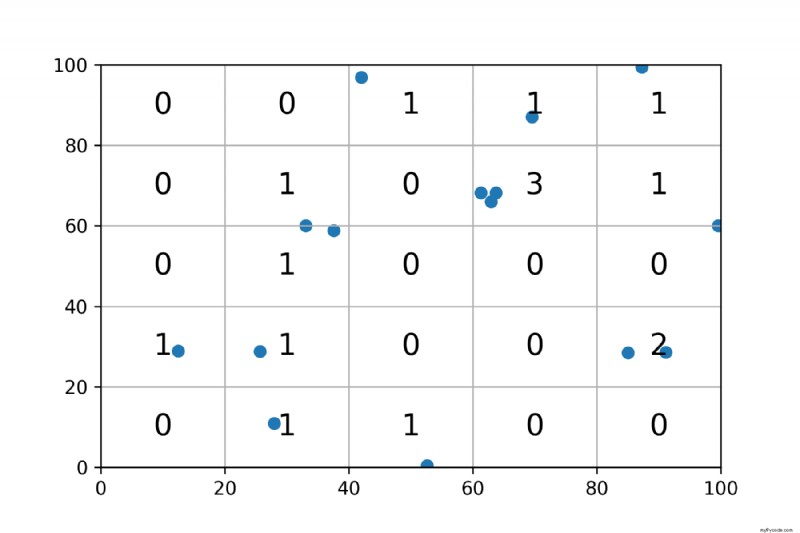
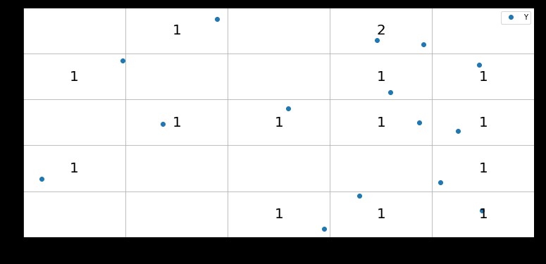
Vous pouvez utiliser GroupBy.size faire correspondre les axes de groupe au centre de chaque grille. Ensuite, vous pouvez utiliser Axes.text pour les dessiner
import pandas as pd
import numpy as np
import matplotlib.pyplot as plt
np.random.seed(20)


max_val = 100
n = 5
len_group = max_val // 5
x = max_val * np.random.random(15)
y = max_val * np.random.random(15)


# Df created for trying to pivot and counting values per cell
df = pd.DataFrame({'X':x,'Y':y})


x_groups = df['X'] // len_group * len_group + len_group / 2
y_groups = df['Y'] // len_group * len_group + len_group / 2

fig, ax= plt.subplots(figsize=(13, 6))

ax.set_ylim(0, max_val)
ax.set_xlim(0, max_val)

df.plot(x = 'X',y = 'Y', style = 'o', ax=ax)
for i, val in df.groupby([x_groups, y_groups]).size().items():
    ax.text(*i, val,fontdict={'fontsize' : 20, 'ha' : 'center',  'va':'center'})
plt.grid()
Vous pouvez simplement créer des bacs avec pd.cut puis groupby les casiers et désempiler le long du X variable et vous avez une matrice de nombres de fréquences.
df['Xc'] = pd.cut(df['X'], range(0, 101, 20))
df['Yc'] = pd.cut(df['Y'], range(0, 101, 20))

mat = df.groupby(['Xc', 'Yc']).size().unstack('Xc')
mat
Xc         (0, 20]  (20, 40]  (40, 60]  (60, 80]  (80, 100]
Yc
(0, 20]          0         1         1         0          0
(20, 40]         4         0         1         2          0
(40, 60]         0         0         0         0          0
(60, 80]         3         0         1         0          0
(80, 100]        1         0         1         0          0